linky links!


shiny!

I find color theory and how it relates to crafting FASCINATING

relatedly, Color, the best crafty nerd book ever!

and the second best crafty nerd book ever, No Idle Hands! 

A Cup of Jo handily rounded up all the ways I can be lazy and pay nice people to do things for me. 

I am restraining myself from buying all the fancy french soap.

I have no real need for a smartphone ring light, and yet I WANT ONE.

I’ve always been fond of whole cloth quilts, and modern quilts. Best of both worlds? (am I the only nerd wondering if the quilting lines are close enough to prevent the batting from shifting? probably?)


The ultimate pasta sauce

It's Marcella Hazan's onion-butter-tomato sauce. 

And it's not just me who thinks so. No one who has tried this sauce doesn't agree.  The beauty part is that it's dead easy, super tasty, and freezes wonderfully.

Make it. Make it now. Seriously. 

don't use this whole chunk of butter. Or the whole onion.

don't use this whole chunk of butter. Or the whole onion.

Here's what you need:

big can of whole tomatoes (though I've fudged it with a big can of chopped tomatoes)

Half a stick of butter

A yellow onion

Salt

Open the can of tomatoes, dump it into the saucepan. Break them up a bit with your (clean) hands or a wooden spoon. Add half a stick of butter (per can of tomatoes, you can double this recipe super easily).  Cut the onion in half, and take off the peel and any root thingies.  If your onion is small, throw in both halves as is.  If it's big, throw in one half, and stick the other half in the fridge for something else. Add a big pinch of salt, and put the pot on low heat.  

The butter will melt into the tomatoes and disappear.  about 30 minutes later, the butter will start reappearing as little droplets of oil on the surface. Fish out the onion and toss it.  Stir, breaking up the tomatoes a bit more if you need to.  

Eat.  

It's like crack, right?. SO GOOD. 

linky links! the food edition

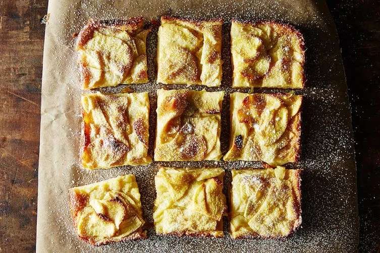
Dorie Greenspan's custardy apple squares on food52.com

Dorie Greenspan's custardy apple squares on food52.com

Why oh why does no one in my house save me like cooked fruit?  This looks AMAZING. 

I myself prefer fudgy, but not overly fudgy, brownies. Food52 breaks it all down

Mmmm. Nachos

It's well worth the trip to Philly for Bassett's ice cream

An oral history of  More Than Words by the brilliant Maura Johnston. Cheese is a food, a delicious, super catchy, awesome food. 

8-bit / Minecraft old school knitting

I am old, and therefore remember when 8-bit graphics were all you got, man.  But these kids today, and their 3-d fancy rendered video games don't know how good they have it!  Hey you kids, get offa my lawn!

Anyway, a few folks I know are interested in making all the cool hipster 8-bit, or Minecraft, graphic knitted things, like say, a hat.  To which I say, I can help with that! (After they told me to write this. So ok. I do as I am told, sometimes)

Knitted color work is not that difficult, it's a trick, like anything knitting.  Once you do it, and puzzle it out, it's easier than you think.

Especially 8 bit graphics and Minecraft emblems, which are already pixelized and therefore DEAD EASY to transfer to a knitting colorwork chart. (I know, all those words may sound scary but THEY ARE NOT, TRUST.) I am going to assume that you already know how to knit, and can knit in the round, because while I can teach someone how to knit in person, online is a whole other ball of wax. 

Colorwork knitting is also called stranded knitting (because you are knitting with two strands of yarn, different colors), or fair isle knitting. In stranded knitting, you are using two colors of yarn per row, and are knitting some stitches in one color, some in the other color.  (There's also intarsia, which is a whole other thing--think the images in ugly Christmas sweaters and big blocks of color.) 

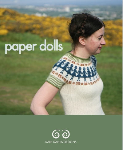
This is not an ugly Christmas sweater. This is Paper Dolls sweater pattern (c) Kate Davies

This is not an ugly Christmas sweater. This is Paper Dolls sweater pattern (c) Kate Davies

You can make all sorts of amazing, complicated-looking color patterns and pretty things with this technique. Kate Davies is a master of this--this is her Paper Dolls sweater, (ravelry link) is it not GORGEOUS? Go click through and look at her other stuff. Go buy her patterns. Support knitwear designers!

So there are a few rules to stranded knitwork, which will make your life easier.   When you're knitting a stitch in Color A, you carry along Color B behind; and vice versa.  Best practices is to keep the strands behind pretty loose so you don't lose the elasticity of the knitting, and to also not have more that 5 stitches of one color at a pop (so your strands, or floats, aren't too long and easily caught on things like hands, and ears, and glasses).

It's easier to understand when you see it (this is not me--this is the wonderful youtube channel, knittinghelp):

Now, the 8-bit stuff! Go find, or go draw, an 8-bit image you like.  Or pixelate a regular image to make it 8-bit-y.  Got it? Ok good. Now you're going to take that image and make it into a knitting chart.  I'd suggest starting with a one-color image, since you're really going to want to only work 2 colors per row of knitting.  Plus it'll look cool and graphic and stuff. 

You can make a pretty simple knitting chart for colorwork in Excel, if you're tech inclined.  Or on graph paper, if you're not or just want to play with colored pencils or markers. Hell, you can even go download knitters graph paper, which mimics the proportions of the knit stitch (slightly taller than it is wide) so your image doesn't come out wider and shorter than anticipated as it may using regular square graph paper.

Take your graph paper, take your image, and transfer the image to the graph paper, square by square.  If you're working on paper, this is actually pretty easy--put the graph paper over the image, and unless you're using fancy thick paper you should be able to see the ghost of the image on the graph paper.  Color it in.  Voila! You now have a chart!

Remember how I said you generally don't want more than 5 stitches between color changes? Look at your charted image and count the squares.  If there's more than 5 stitches in a color span, add a dot of the contrasting/background color.  (like so: XXXXXoXXXXX) I promise it won't look too weird.  

Ok, so now you have your charted, tweaked, image.  You can knit it! Knitting from charts is straightforward. Each box is a stitch. If the stitch is colored in, knit it with your image color.  If it's not colored in, knit it with your background color.  You'll be working from the bottom of the chart up, and reading/knitting the chart from right to left, bottom to top. Each row of the chart is a row of knitting. If you're knitting in the round--and for reals, you should be, it's easiest to go circular for stranded knitting--this means each row is a round, and you will ALWAYS be starting at the right hand side of the chart and working to the left. 

Depending on your gauge/the size yarn you're using, you can repeat the image around the circumference of the hat, like say, a line of space invader dudes around the brim of a beanie. To do this, take your chart, and  make sure you have a few stitches/columns on either side of the motif in the background color. Now, count the stitches in the chart, including these columns, this will be your repeat.  

Let's say you're doing a hat with a 10 stitch motif, and you want two stitches between each motif--your repeat is 12 stitches.  Cast on a circular needle enough stitches for a hat: MAKE SURE THE NUMBER OF STITCHES ON YOUR NEEDLE IS A MULTIPLE OF YOUR REPEAT. (in this case, 60 st, or 120 st, or whatever works with the size yarn/size head). No one wants a space invader cut in half.  Use a stitch marker to mark the beginning of your round. Work a few rounds in the background color, either in a non-curling pattern (like rib) or for an inch or so in stockinette (for a rolled brim)

When you hit where you want the image, begin your chart. As you knit, you'll knit the first row of your motif as per the chart, and then the two stitches in the background color, then knit the first row of your motif again. And the two stitches of the background color, again.  Repeat all the way around.  Then do the second row of your chart, and repeat it all the way around.  Then the third row....etc. when you've completed the full chart of the motif, break the motif yarn, leaving a tail, and finish up your hat with the background color. 

(How to finish a hat you ask? Knit until it's as tall as you want, then decreasing for the crown at even points. Divide your stitch count by 6 or 8, and mark these points using stitch markers. K2together at those points every other round until you have half as many stitches as you started with. Then k2tog at these points every round until you have either 6 or 8 stitches--depending on how many points you picked--break yarn and pull the yarn through those stitches left, pull tight. Weave in ends, boom you have a hat.)

So, let's say you're working in super bulky yarn and only want one image on your hat.  

  1. I hope you like weaving in ends.  
  2. Consider two images? One front, one back?
  3. No? How about a dotted hat, alternating the two colors around the hat, except where the motif is (aka:  knit the motif, then knit 2 stitches background, 2 stitches motif color, around until you get back to the motif)?
  4. Still no? Welp, get ready to weave in ends. 

Ok then. Follow the same instructions, only decide where you want your motif.  When you're ready to start the image, begin knitting your chart the same way. Knit the first row of your chart once, drop the motif yarn, cut leaving a tail. Knit in the background color til you get back to the motif. Add in motif yarn, leaving a tail, knit the second row of the chart, drop the yarn leaving a tail. Repeat.  

Finish up the hat and weave in the copious amount of ends and regret your choices in life.  (I kid! I kid!)
Valentine's Linky links

"A long flight ahead" by Kristina Alexanderson  www.flickr.com/photos/kalexanderson/

"A long flight ahead" by Kristina Alexanderson  www.flickr.com/photos/kalexanderson/

I know it's been floating around the web for a while, but Kristina Alexanderson's photography is so stunning, and so emotional. 

Nothing says love like the Ron Swanson Pyramid of Greatness.

minecraft perler beads, whaaaaat? Genius! (Via make magazine) 

no one wouldn't want a Yoda valentine.

Yes. Love. Unless you hate everything bagels. 

I do love a grownup coloring page. 

One day, I will plan ahead and order a custom toy portrait.  

Paint the things...paint ALL THE THINGS!

It all started because I can never find 4x4 square picture frames for Instagram photos. I had two silver ones that we hung on the wall, but the space called for a third one. And for the life of me I could not find another silver square frame. 

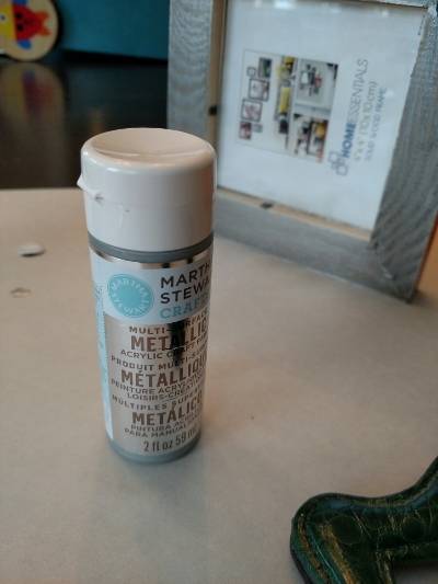
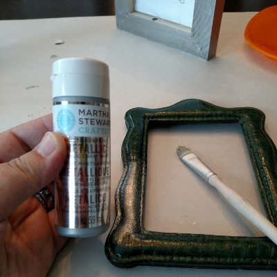
 I stopped at A.C. Moore the other day to see if they had valentines (they did not), and came out with about ten non-silver picture frames, some e5000 glue (the best most toxic glue ever), and this paint, from Martha Stewart's craft line with plaid.

i expect no less from Martha.

i expect no less from Martha.

Now the quickest, easiest way to dress up cheap picture frames is paint. Go get some crappy looking, crappy colored, or cheap unfinished frames, and paint them all the same color. Various sizes, shapes, texture frames became unified cohesive and sophisticated with $5 at the craft store.

My maternal grandmother is a fine artist, and she has drilled into me over the years that frames solid always be either metallic (silver, gold, bronze, platinum​), or black. And I for one am not about to argue with a 98 year old Austrian woman for fear of how badly she will school me. 

I am a big fan of using metallic craft paint to dress shit up, and the Martha Stewart line had some if the best, actual METALLIC metallics I've seen in a while​. But I also expect any Martha branded line to have an excellent color palette.​

SHINY! Note the lazy man's way of keeping the paint off the glass, using the paper insert from behind the glass and tucking it between the front and the glass.

SHINY! Note the lazy man's way of keeping the paint off the glass, using the paper insert from behind the glass and tucking it between the front and the glass.

​It is amazing, you guys. AMAZING. Unlike most acrylic craft paint, it claims it can be used as is on multiple surfaces, including metal and glass (prepped and cleaned with alcohol first), and after a 21 day curing time, it's theoretically dishwasher safe. ​​

Most of the old school craft paints are standard acrylics, which is to say they dry flat matte, and sometimes stay a bit tacky or lift the color if the painted thing is left on shelf and hasn't been sealed. that's not to say they're not exceptionally useful.

kind of shiny, ish?

kind of shiny, ish?

I stenciled my dining room to mimic wallpaper using two colors of metallic craft paint mixed into a little​ shimmery latex wall paint. And I used the same two paints for stencils and foam stamps on paper for holiday cards for years. But for painting objects, I would never use straight craft paint without a primer or gesso and an acrylic sealer. And sometimes the sealer would turn an object into a little-too-glossy bit of cheese.

So far​, this paint has retained its gloss as it dries, and I am not planning to seal or varnish the frames.

Martha (yes we are on a first name basis, at least in my head) recommends an hour drying time between coats, so after i used a foam brush to do a quick thin coat on the wide wood frame, I went looking for other shit that needed painting.

ALMOST SHINY!

ALMOST SHINY!

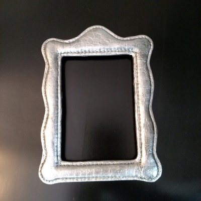
Like this weird faux croc 1990s padded picture frame up above (which holds my senior prom picture. Yes I have had this frame for more than 20 years). It needed painting.  AND NOW IT'S METALLIC!

MOAR SHINY!

MOAR SHINY!

 (Also quick plug for the Martha branded paint brushes. I let the littles use this one, and attempt to destroy it, for the last three years. A bit of cleaning and it's still in great shape.) 

ALL THE SHINY THINGS !

ALL THE SHINY THINGS !

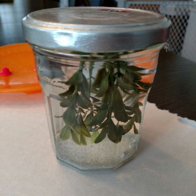
...and this diy'd snow globe from Max's preschool. It is an old jam jar, and had a red and white checked top that didn't look super awesome. AND NOW IT'S METALLIC!

SHINY SHINY SHINY!

SHINY SHINY SHINY!

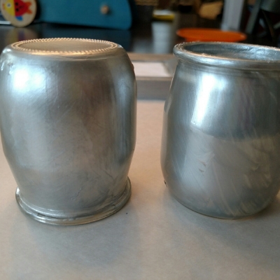
... and these tiny glass jars from the fancy pants French yogurt i get occasionally. The one the left has 2 thin coats on the outside of the glass. The one on the right has one thin, kind of uneven, coat on the inside. I won't use either for food use, but they're cute bud vases, no?


I literally walked around the first floor with the paint brush saying, "what else needs painting??"

The cats better run...

NOT YET SHINY!

NOT YET SHINY!

linky links!

cookiecrack

Trader Joe's made COOKIE BUTTER SANDWICH COOKIES.  The bastards. 

CAN. NOT. WAIT.  Into the fire, higher and higher!

I love a good variety show.  And I mean, NPH was born for this.  

Nostalgia is one thing.  But this essay lays out how your sacred childhood cows aren't so sacred. Doesn't necessarily mean the remake or whatever will be GOOD, but I am looking forward to the Ghostbuster ladies and  I can really get behind Chris Pratt as Indiana Jones.

Love these kind of behind the scenes, how the sausage gets made, of SNL

Man does Jupiter Ascending look like a giant pile of shit.  The costume and makeup design alone is atrocious. Channing Tatum should never be blonde.

An excellent essay at Grantland about critics and historical fiction